30 LinkedIn Tips: #6/30 – Use a custom header image
30 short, useful, actionable LinkedIn tips in 30 days from Doctor David Petherick. #30by30 #TheDoctorisIn
#6/30: Use a custom header or background image on your LinkedIn Profile.
- Originally written: October 6, 2017
Last Updated: June 9, 2023
You have free advertising space at the top of your profile: why don't you use it?
You have a free piece of advertising real estate at the top of your profile - it's called a header or background image.
Many people don't bother to add an image - but you can use yours to differentiate and brand yourself to stand out from the many millions of other profiles on LinkedIn.
So rather than leaving it blank, invest some time and thought into personalising your header to showcase your talent and underscore your personal or corporate branding.
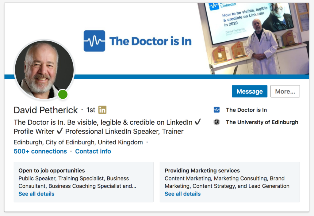
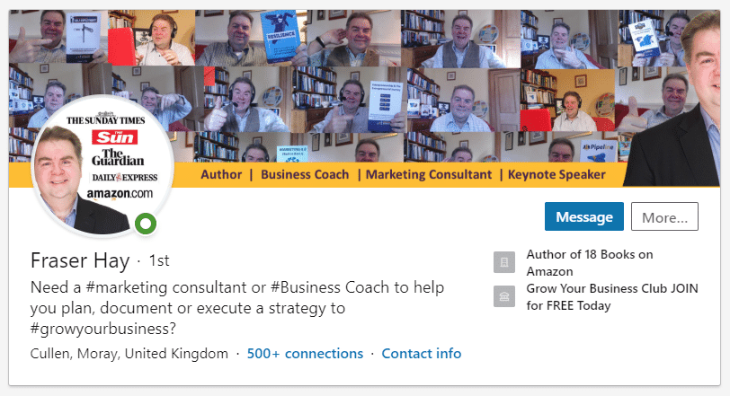
This is the February 2020 version of my profile header image - a mixture of text and photo, and it has a clear branded message.
You need to be aware that you're dealing with an oddly-shaped 'viewing window' with an area on the left obscured where your own profile photo will appear. This appears differently on mobile devices.
But it's easy to use this element to stand out from the 930 million+ other individuals on LinkedIn.
- Graphics Tip: If you have no graphics editing software installed on your computer, or don't have experience of using a graphics program, try using a simple, free, but powerful online tool that makes it easy to create a custom header image, with options to upload your own logos or photographs and then add text - canva.com
- Stock Images Tip: If you are looking for free stock images to illustrate your header image, try pixabay.com which has thousands of images that are free to use.
How do I add my header image?
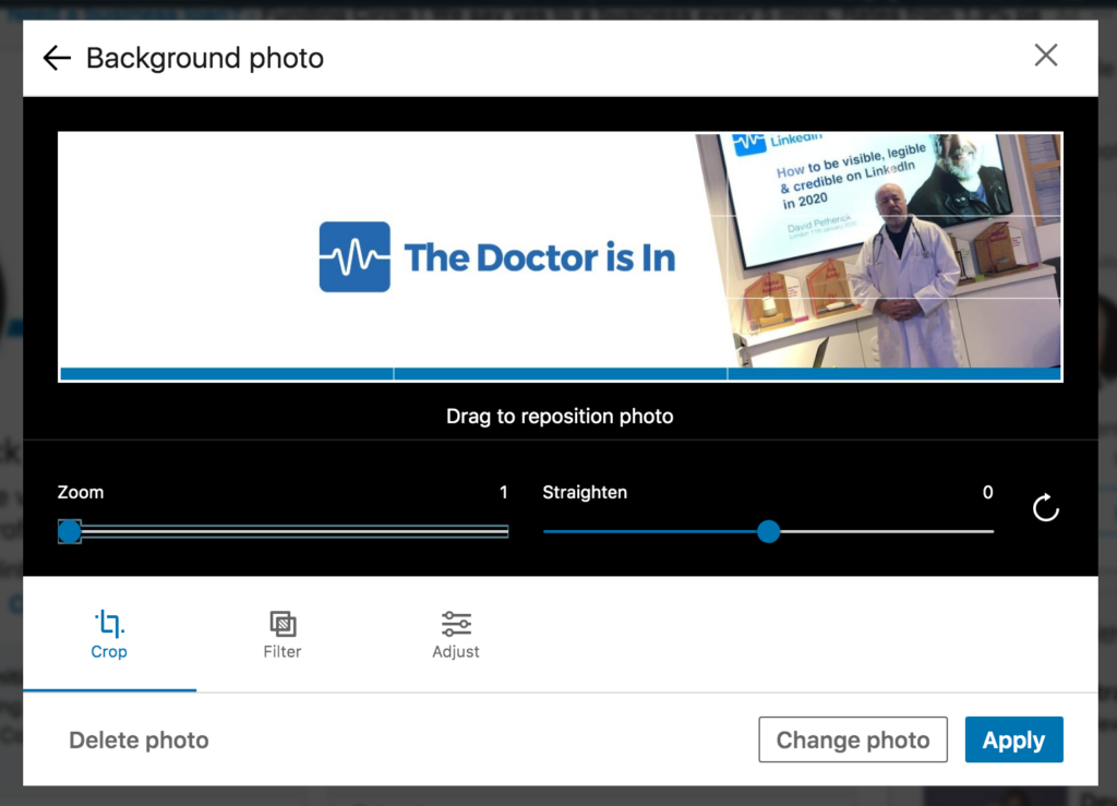
Easy - just click to edit your profile, and then click into the area at the top to select ‘Edit background’.
The image size you upload should ideally be 1584 wide by 396 high in pixels. You can use much larger images, but smaller sizes are not recommended as they are in danger of being stretched and pixellated - not a very professional look.
As you can see from the example above, you need to bear in mind that LinkedIn places your photo over your header image on the left, so it's worth remembering this when designing the image.
On mobile, changes are rolling out to make this consistent, but many people will still see the photo over the centre of the background image.
The good news is you can, once you've uploaded your image, move it around vertically to get it looking good. You can also add filters, crop, tilt and adjust to get it looking just right.
You can't currently move the image horizontally, so you may need to crop, or experiment in your image editor to get the best image and overall positional balance for all the elements.
Not a graphic design expert? Try using the free and very simple to use canva.com to manipulate your images, add text, shapes and stock graphic elements. It's very easy to use, and did I mention, it's free?
Need a header designed for you? I can recommend the services of James Clifford to create a stunning personalised header to represent you as an individual or to showcase your business. See some examples of his work below, or check out his portfolio page where you can order designs here.
Examples of James Clifford's LinkedIn Header Design work
Try some things out first...
Generally speaking, the best thing to do is to experiment with a few different layouts, and then check how these look on different devices. You can also ask a LinkedIn connection to send you screenshots of your profile, so you can see exactly how things appear to them.
There are more than 675 million people on LinkedIn as at January 2020.
Most of them don't bother to add a custom header at all.
So you, you clever person you, can use this simple opportunity to stand out from the crowd.
- You can also use the image to literally 'position' yourself against the background you want to be seen working in, so you can use a stock image of a new industry, or a skyline of the city you want to be working in next in your career.
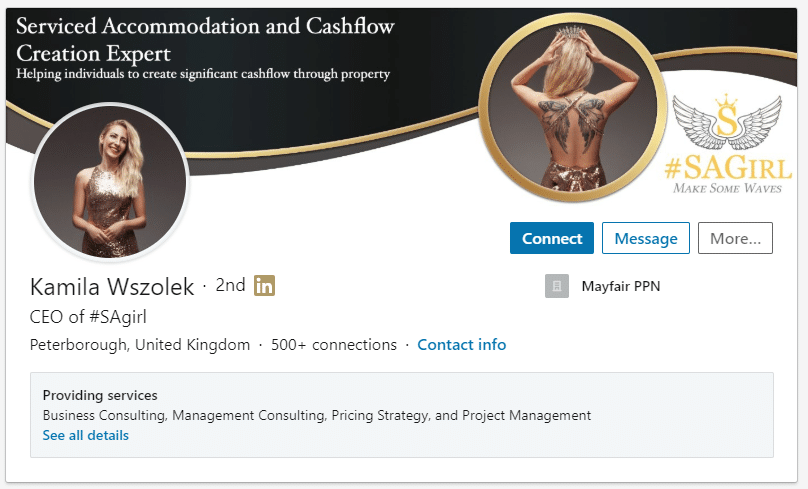
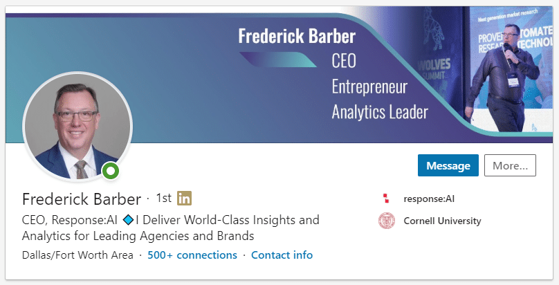
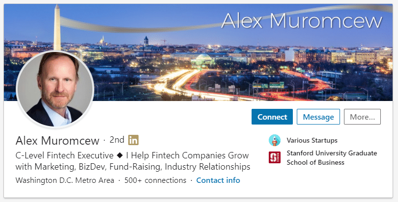
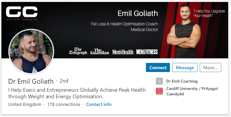
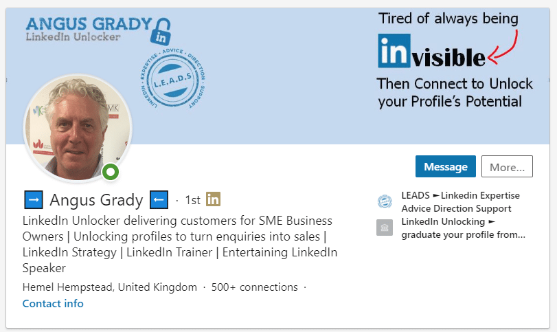
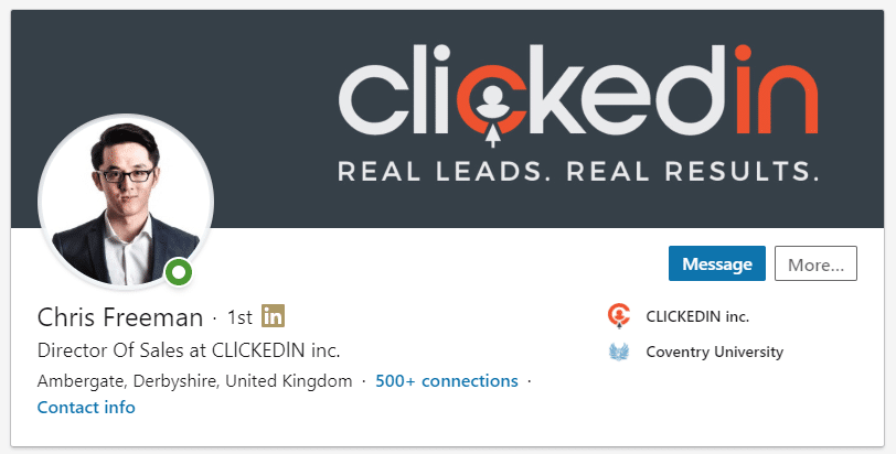
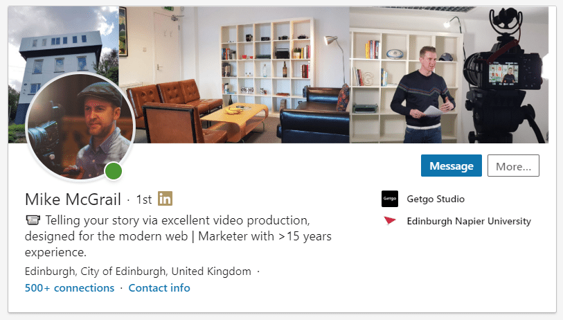
Here are some nice header images I've spotted recently: -
- More Tips: 30 Top Tips for a better LinkedIn Profile – Rounded up and summarised…
- Found these tips useful? Why not thank me by buying me a coffee?

